Robyn is an automated Marketing Mix Modeling (MMM) open source code by Facebook Experimental. It aims to reduce human bias by means of ridge regression and evolutionary algorithms.
What is Marketing Mix Modelling ?
Marketing mix modeling is an analytical approach that uses historical information, such as sales data, to quantify the sales impact of various marketing activities like TV ads, OOH ads, Digital Marketing etc…These results can then be used to estimate the impact of each marketing channel on total sales and further find the optimal distribution of available budget so that the sales can be maximized.
What is Robyn ?
It’s a open source R package developed by the Facebook’s experimental team that automates most of the tedious tasks of MMM like model building, creation of various charts, various mathematical details etc. Robyn is actually a semi-automated tool for MMM; it generates and stores various models as part of execution (the hyperparameters vary in each model) and the final model to be used for generating optimal budget mix is left to the user to choose. The user can analyze the results generated by various models and select one that best suits the type/domain of data being used.
Analysing Robyn
There are certain hyperparameters that are to be set by the user using which various models are built by Robyn and the respective results are stored. Each model outputs a set of 6 charts that the user can look up onto and decide which model makes more sense to the type of data/domain that we are using. Below are the example charts that give you a sense of what actually the model has learnt about the data.
1) Actual vs Predicted Response graph
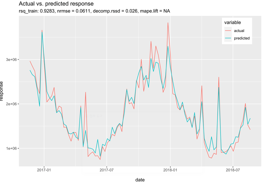
You can see how well the values predicted by the model are fitting against real data. This is the key graph in determining the performance of the model.
2) Response decomposition waterfall by predictor
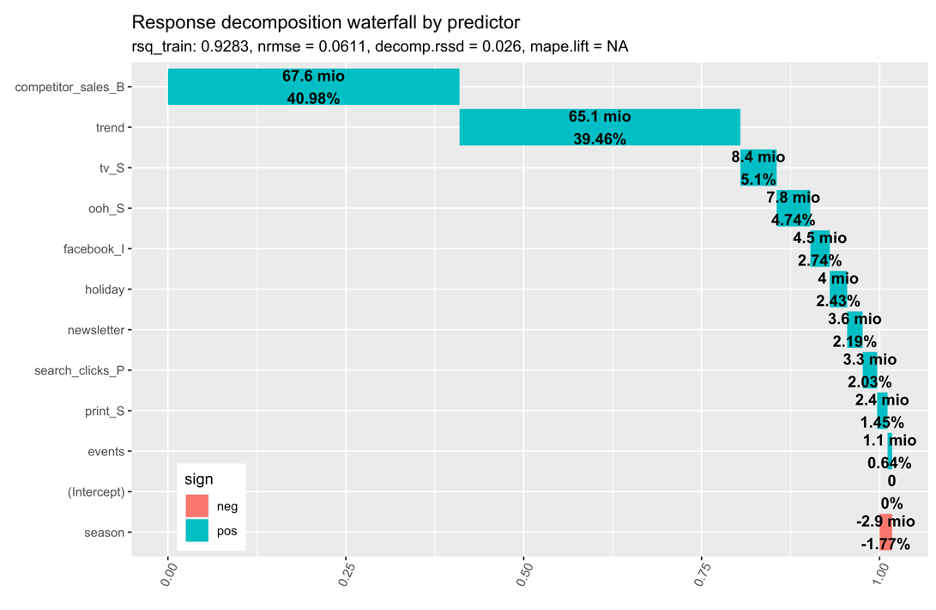
This graph shows the decomposition of various factors influencing the total sales. These can be marketing channels, trends, competitor effects, baseline sales etc.
3) Share of spend vs. effect with total ROI
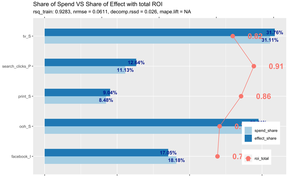
This graph depicts the comparison between the spend share of the marketing channels against their share effect in influencing total sales. For eg., a channel with a high ROI but low spend can indicate a potential increase in spend share.
4) Response curve
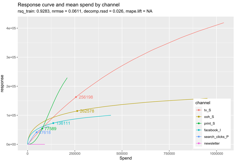
Response curves indicate if a specific marketing channel’s spend is at an optimal level or if it is approaching saturation and therefore suggest potential budget reallocation. The faster the curves reach an inflection point and to a horizontal/flat slope, the quicker the media channel will saturate with each extra ‘dollar’ spent.
5) Adstock decay rate
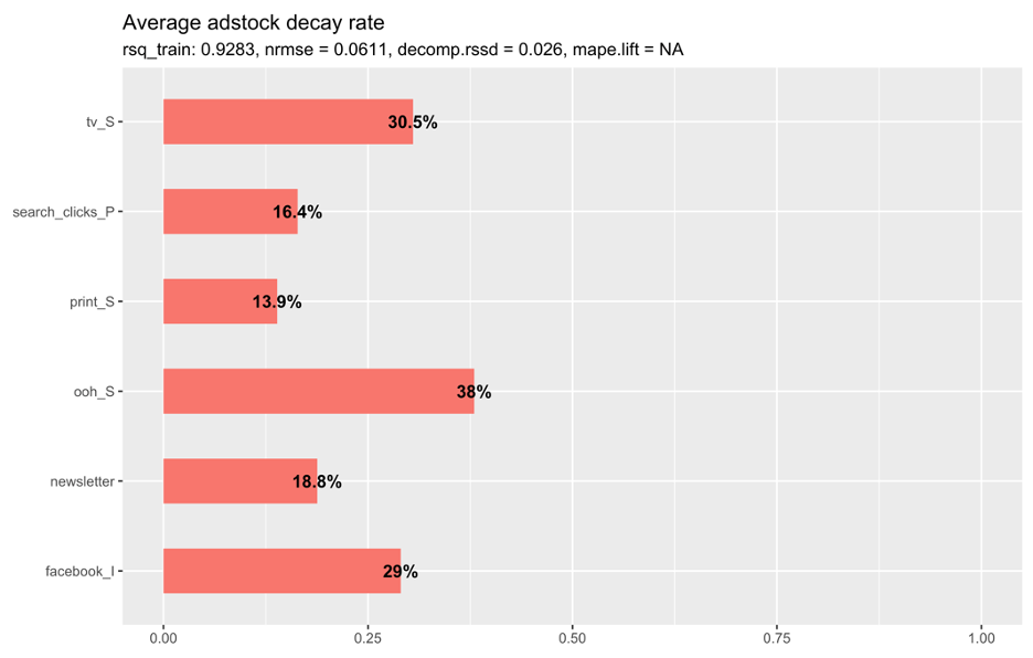
This chart represents, on average, the percentage decay rate of each channel. The higher the decay rate, the longer the effect that a specific media channel has after the initial exposure.
Robyn Budget Allocator
For every selected model result, the “robyn_allocator()” function can be applied to get the optimal budget mix that maximizes the response. There are two scenarios to which you can optimise for:
Maximum historical response: Assuming the same historical spend, this suggests the optimal budget allocation that will maximise response or effectiveness;
Maximum response for expected spend: This suggests the optimal budget allocation to maximise response or effectiveness, where you can define how much you want to spend.
As a result of using the budget allocator function, three charts will be produced. Below is one such example Chart;
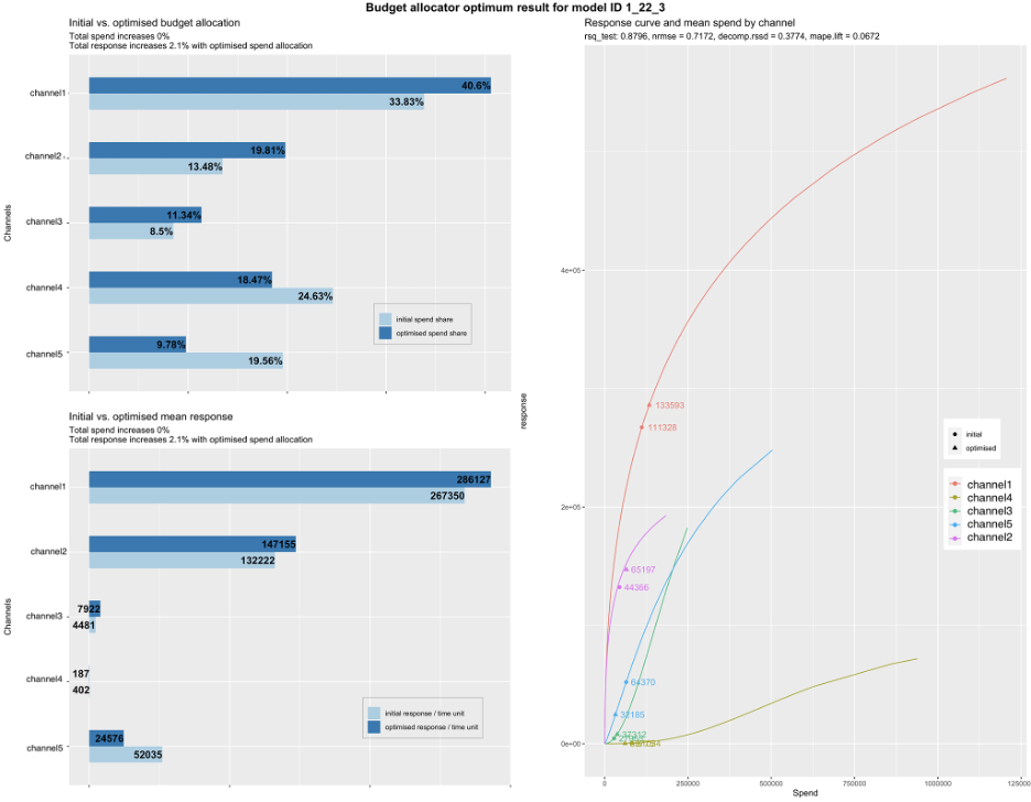
Initial vs. optimized budget allocation: This graph shows the original spend share vs. the recommended/optimised spend share to maximise the response/effectiveness.
If the optimised share is greater than original, this means it is recommended to increase budgets for that channel. Alternatively if optimised is lower than original,
it is recommended to reduce spend for that channel.
Initial vs. optimized mean response: Similar to above, this chart shows the original and optimised expected response.
Response curve and mean spend by channel: The response curves show how saturated a channel is and where a channel is on the curve for the original and optimised spends.
Conclusion
Facebook’s Robyn does a really good job in automating the MMM part without we needing to manually fit the various models and the problem that come up dealing with them. If understood well the results in the form of graphs provide really good insights. We tried using Robyn on Complan’s data to identify the performance of various marketing channels. Due to the lack of enough data points we could not successfully use the full potential of Robyn features as the model did not fit well into our data. But if we have good amount of data points across time and want to analyse the performance of marketing channels. Robyn should definitely be tried. We can mainly get insights on two aspects; How well each marketing channel has performed (spend vs return)? and how to optimally distribute the next set of budget across marketing channels.